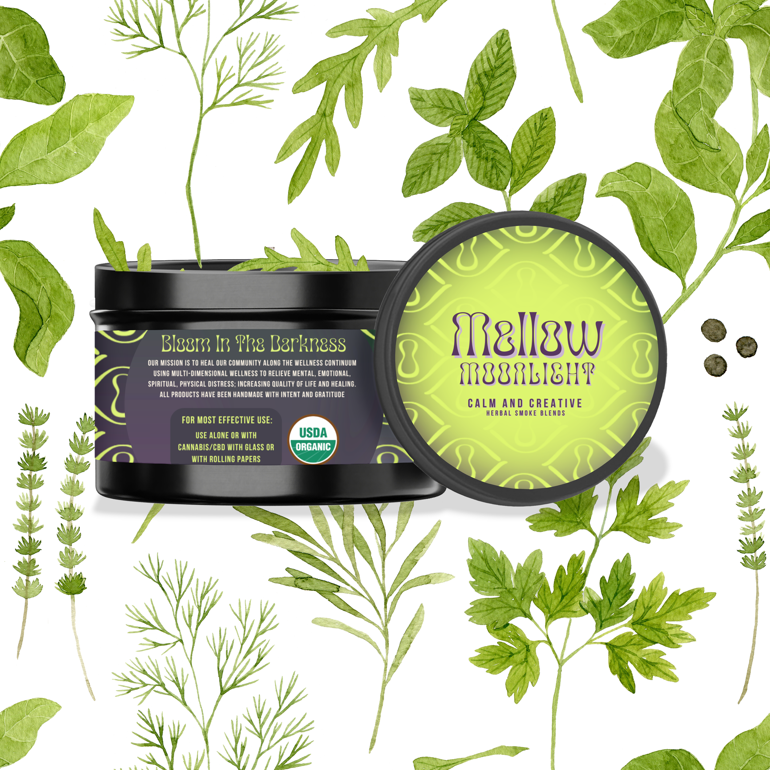
Lily of the Valleys Evolution is an Herbal Apothecary and Healing Sanctuary - guiding people through traumas with plant healing, breathwork, trauma decoding, and guided self-actualization. Become wholisitically aware to authentically accept, align, alchemize and ascend through adversity - Bloom in Your Darkness!

Brand Overhaul
Brand Overhaul
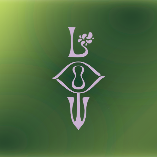
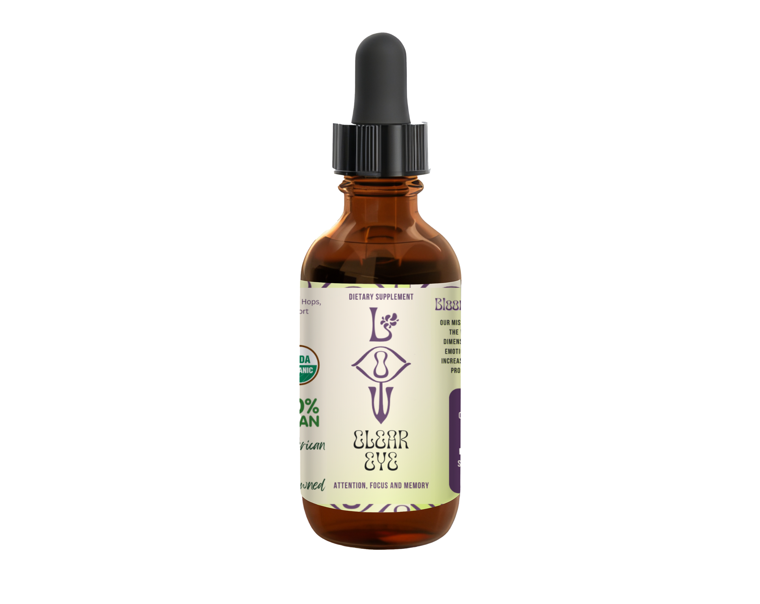
The purpose of the brand overhaul was to create unique, eye-catching, modern and consistent brand culture + language through visuals. LOV Evolution is not only an herbal apothecary. It is also a space for cognitive life coaching that focuses on trauma decoding and introspection of shadows within self. The flower Lily of the Valley blooms in the shade which holds the entire concept of the brand. The herbal name as an element of herbal healing, the function of the plant blooming in the shade instead of the more common blooming in sun, and the necessary function of plants absorbing oxygen at night preparing to grow and create new cells in the sun - all aligns with the concept of going into your trauma and negative self-concept, using the breath to activate new pathways in the vessel, and healing with plants to get the vessel back to equilibrium and optimal health. Healing with this wellness lifestyle brand is like stepping through a portal and the visuals reflect the multidimensional wellness that leads to authentic, lasting evolution.

New Brand Color Palette
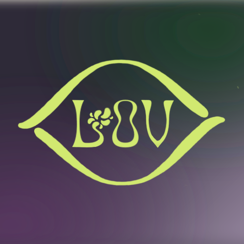
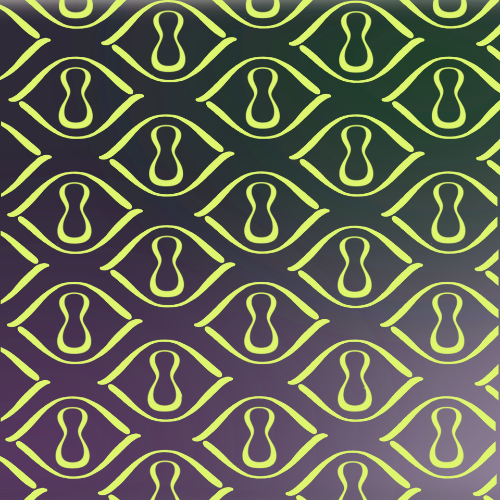
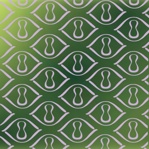
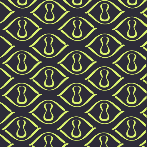
Crown Chakra purple shades for core method to decode and reprogram in the mind and spirit, Herbal, Earthy shades green shades for core method to support acute + some chronic ailments in healing with plants and herbs, and Moonlight, Midnight Sky inspired shades for core philosophy of introspection of traumas in relation to self concepts and external perception. A decision to go with a glowing almost neon green to add another element of blooming and glowing in the dark. The colors cohesively reminiscent of a midnight portal.
New Brand Fonts

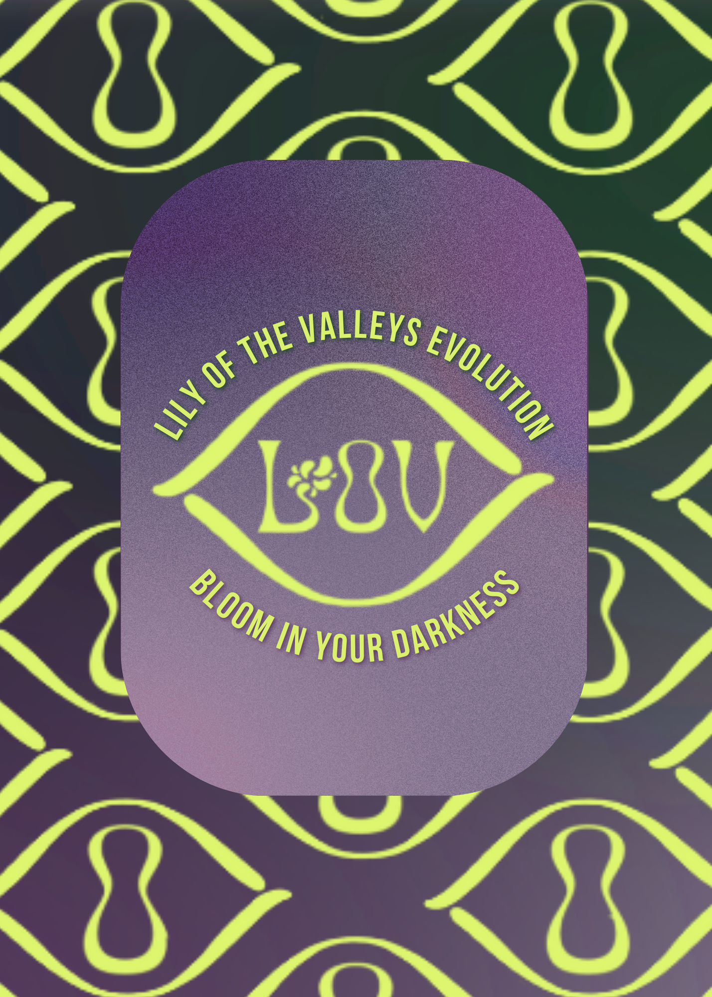
Canobis

Bebas Neue
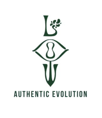
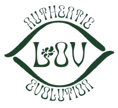
Elements of the font were manipulated and added to creating primary, secondary, and graphic logos. Concepts of herbal healing placed into the “L” with a graphic flower. Valleys and shadows concepts in the vertical logo with curved cohesive lettering. Lastly, use of the Canobis lettering to create an eye graphic for consistent brand visuals with typography. Gradient colorways for ethereal, portal feel with diverse schemes that resonate with the herbal apothecary, cognition and breathwork methodology, and guided introspection of traumatizing or adverse experiences.


Continued steady growth with only four posts a week, three stories a day with informative, scroll stopping and interactive reels, carousels, and posts.
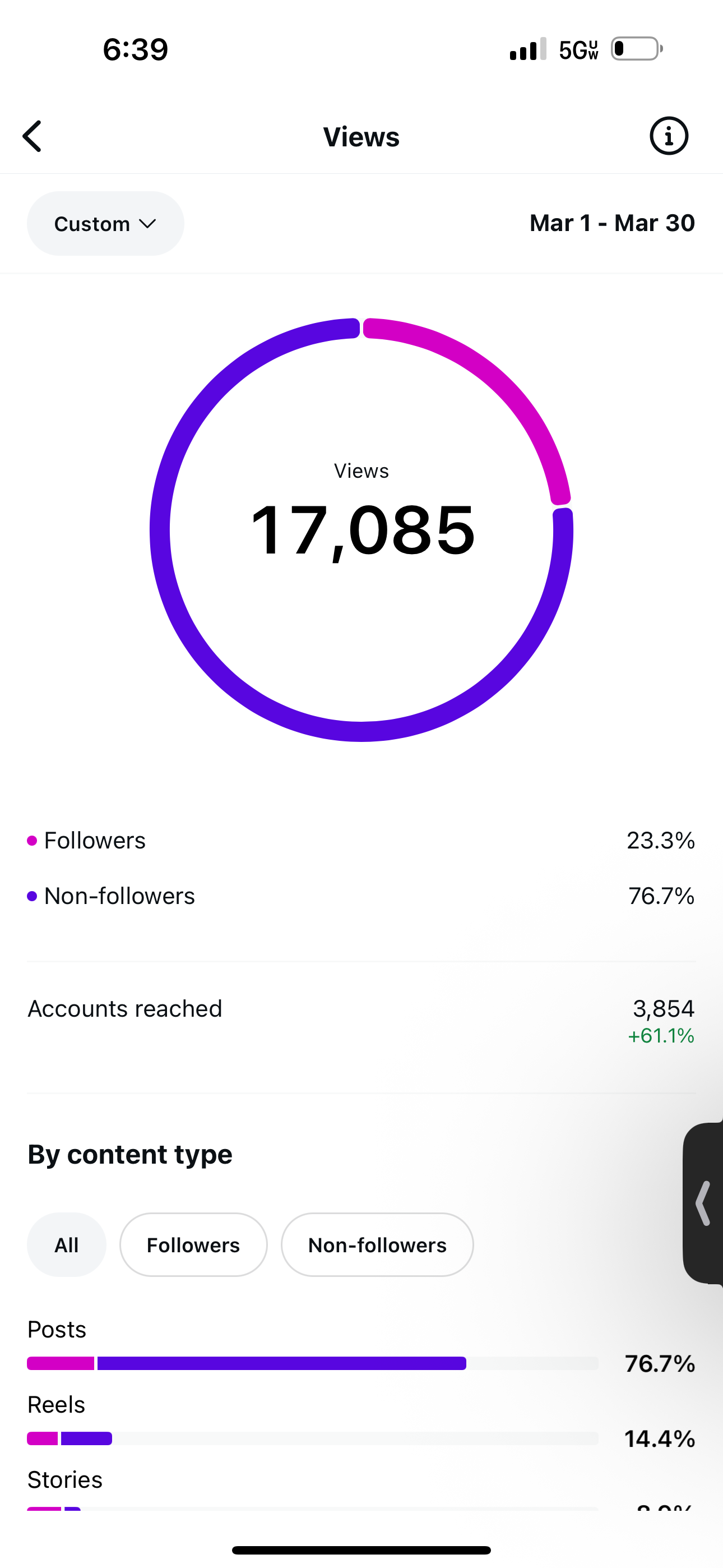
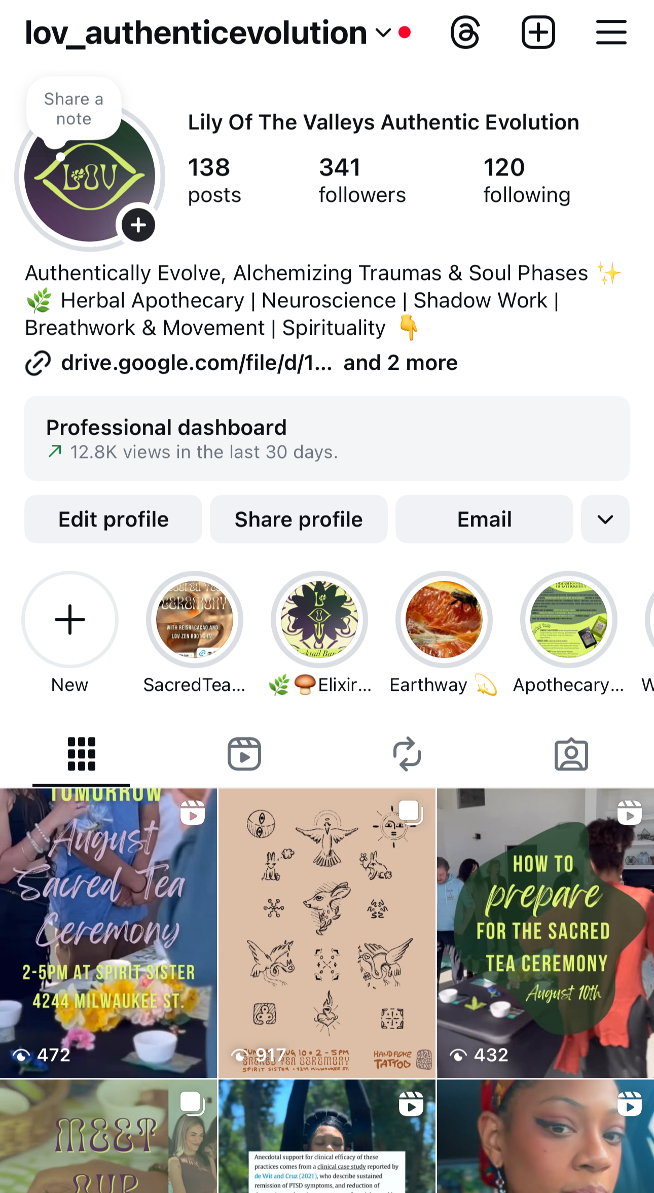
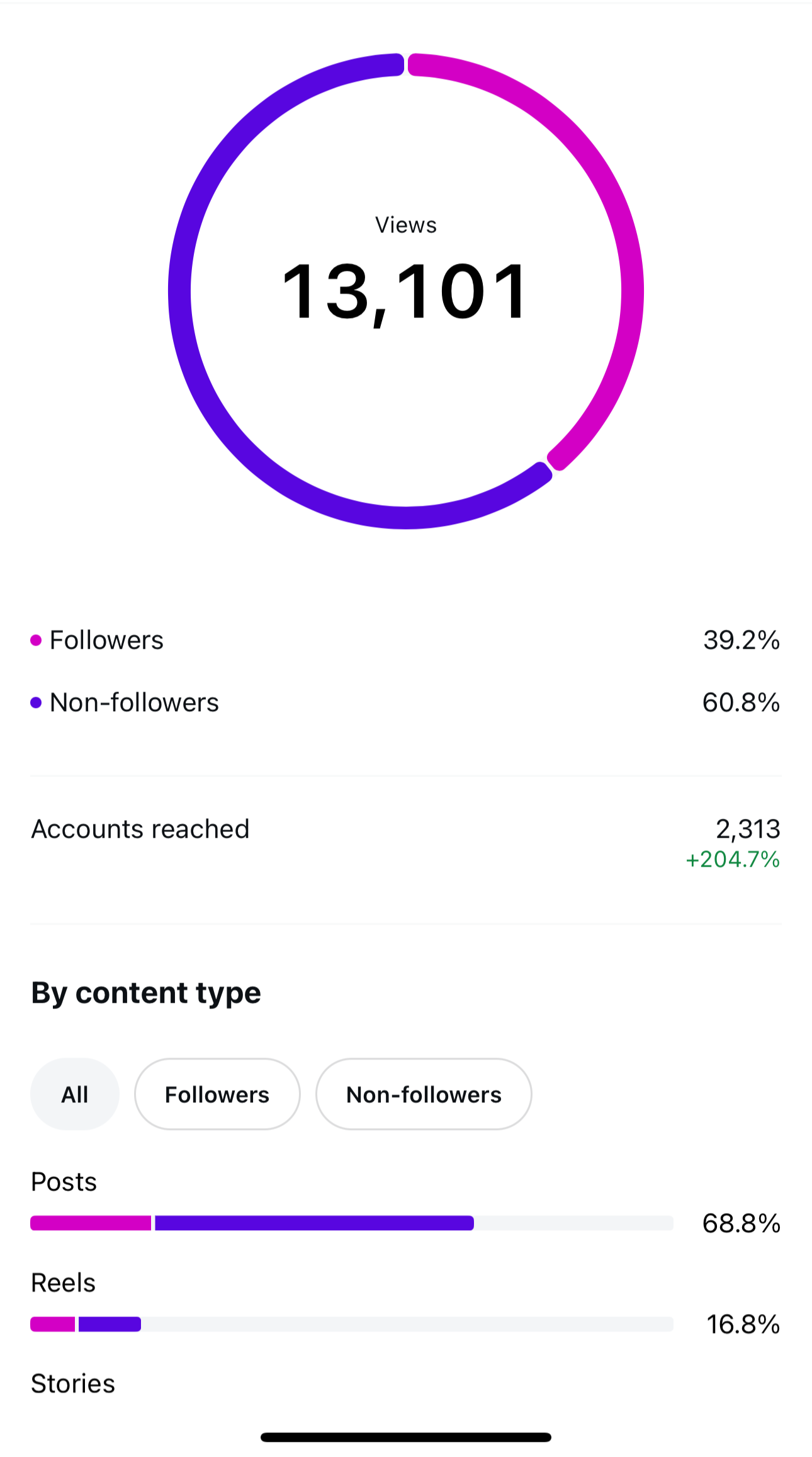
Organic growth with no paid ads over 3-Month Period
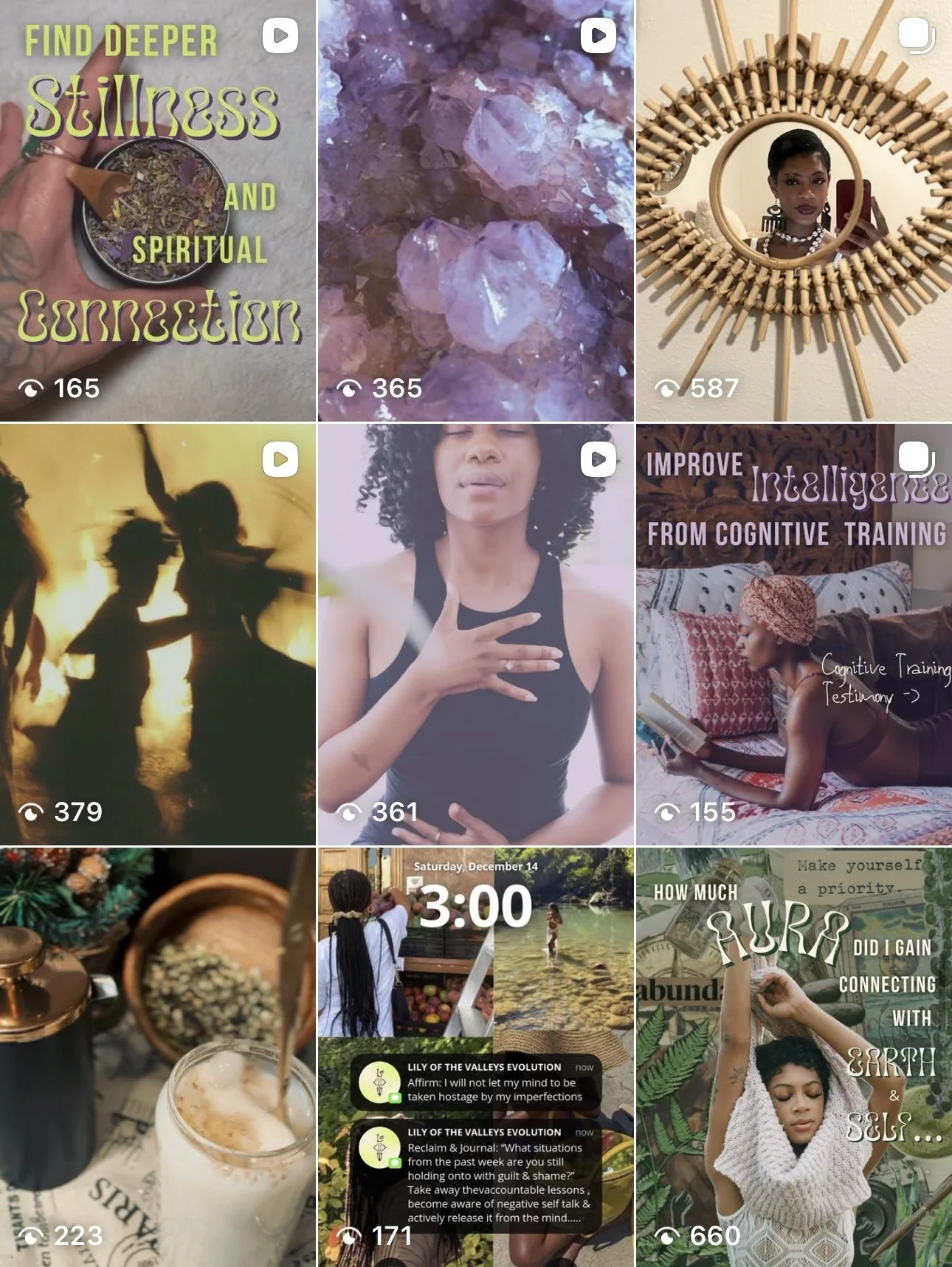
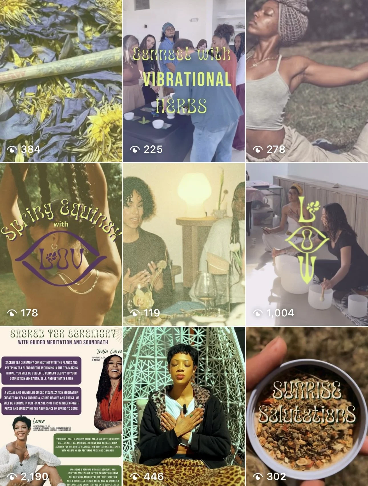
155-660 views per post
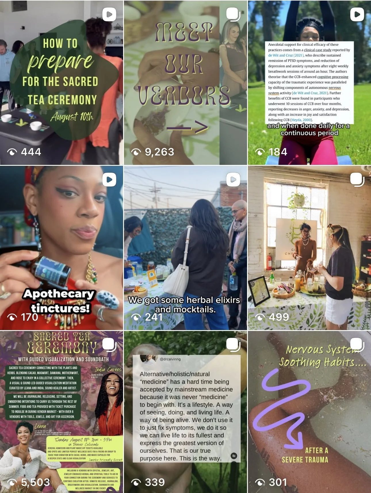
178-2000 views per post
184-9000 views per post
In a 90 day research container I transformed my herbal coaching brand, with little to no following, through a full visual and cultural rebrand, analytics-led content strategy, and multi-format storytelling across Instagram, email, and live events. By building a cohesive brand ecosystem—complete with revamped identity, consistent content systems, and audience-nurturing newsletters—I grew the community 5x organically, reached 13K+ monthly views, and generated 100+ event, product, and service sales with zero paid ads.